Showing posts with label art. Show all posts

Friday, November 14, 2014

Cartoon Versions of Glycolytic Enzymes - Part I

Cross-posted from my Tumblr

Someone on Tumblr asked for help understanding glycolysis (along with a lot of other things, but I decided to focus on glycolysis first), so I had the brainwave of drawing cartoon versions of all the glycolytic enzymes.


Here are my cartoon interpretations of the enzymes catalyzing the first five steps of glycolysis:

1. Hexokinase
Hexokinase, drawn as a pair of interlocking jaws with a space for glucose and ATP
I drew this one to look like a huge snapping alligator jaw that fits together like a jigsaw puzzle, except for a small space near the back for glucose and ATP to fit into. (See the links at the bottom of this post, and also this blog -- particularly this post -- for more realistic images of hexokinase).

2. Phosphoglucose isomerase
Phosphoglucose isomerase, drawn as a stylized pair of interlocking hands
I have functional as well as structural reasons for choosing this way to represent this enzyme; besides the fact that its structure really is two identical subunits shaped roughly like twin blobs with long arms wrapped around one another — arms that remind me of thumbs sticking out from fists — I also figured that, since its function is to break the ring that makes up glucose, change a few things around and then let the ring re-form into fructose, a pair of hands looks like something that could do that. Like I drew hexokinase — whose function is to clamp itself around glucose — as a pair of jaws, I drew this one thinking to evoke some everyday-life analogy for what it does. The analogy that occurred to me was cracking an egg, which I do with two hands, using my thumbs to pry the shell open. (See the links at the bottom of this post, plus this one*, this one, and this one, for more realistic images of phosphoglucose isomerase).

3. Phosphofructokinase
Phosphofructokinase, drawn as a pinwheel with a smiley face in the middle
I drew a pinwheel to represent phosphofructokinase. I chose that shape because most of the drawings and computer models I found of its structure seemed to show a radial symmetry, of either 90 or 180 degrees depending on which image I was looking at. (See the links at the bottom of this post, plus this one, this one, this one and this one, for more realistic images of phosphofructokinase).

4. Aldolase
Aldolase, drawn as a pair of butterfly wings
I chose a butterfly for aldolase because in most of the drawings and computer models I could find of its structure, it looked like it had mirror symmetry. (See the links at the bottom of this post, plus this one and this one***, for more realistic pictures of aldolase).

5. Triose phosphate isomerase
Triose phosphate isomerase, drawn as a barrel with a face
I drew this one as a barrel, to reflect the "beta barrel" that makes up its interior structure, and contains the active site. (See the links at the bottom of this post, plus this one, this one and this entire blog -- particularly this post -- for more realistic images of triose phosphate isomerase). 

As you can hopefully see if you've been clicking on the links, I've tried to anchor all of my cartoon avatars of these enzymes in some element of their actual structure.

Here are some general links where you can see some decent representations of the structures of all ten of these enzymes:

Glycolysis (enzymes of the preparatory phase)

Glycolysis (enzymes of the payoff phase)

The Glycolytic Enzymes (PDF)

Notes

*The linked image is an illustration from an evolutionary biology textbook -- Evolution, by Nicholas H. Barton, Derek E. G. Briggs, Jonathan A. Eisen, David B. Goldstein, and Nipam H. Patel. The book has a website, where you can see some of the content -- including all the illustrations -- for free. 

This particular image is not original, though -- the ultimate source is a paper from 2006 by Christopher W. Wheat, Ward B. Watt, David D. Pollock and Patricia M. Schulte. It was published in Molecular Biology and Evolution and you can read the full text here.


**The linked image is Figure 2 from this article in Biochemical Society Transactions


Citations

Mitternacht, S., and Berezovsky, I. (2011). Coherent Conformational Degrees of Freedom as a Structural Basis for Allosteric Communication PLoS Computational Biology, 7 (12) DOI: 10.1371/journal.pcbi.1002301

Perica, T., Marsh, J., Sousa, F., Natan, E., Colwell, L., Ahnert, S., and Teichmann, S. (2012). The emergence of protein complexes: quaternary structure, dynamics and allostery Biochemical Society Transactions, 40 (3), 475-491 DOI: 10.1042/BST20120056

Wheat, C. (2005). From DNA to Fitness Differences: Sequences and Structures of Adaptive Variants of Colias Phosphoglucose Isomerase (PGI) Molecular Biology and Evolution, 23 (3), 499-512 DOI: 10.1093/molbev/msj062

Saturday, August 16, 2014

More Pictures of the Tiny Sketchbook for Drawing Tiny Things

It occurred to me after I'd made this post that it would've been a good idea to include pictures of the notebook itself along with the pictures of the things I've drawn in it.

So here they are now!
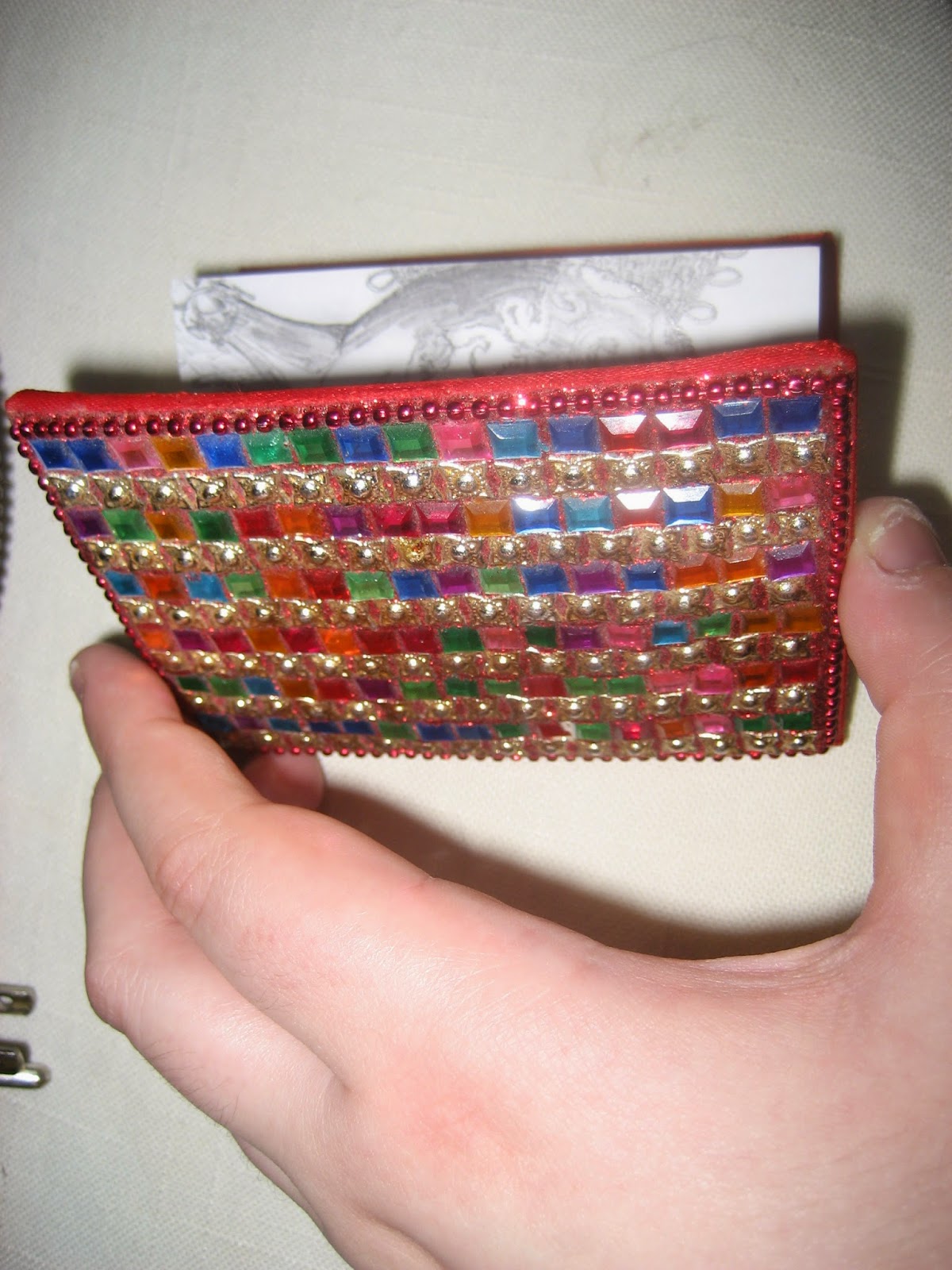
A shot of the cover of my jeweled pocket notebook. It looks like a game of Bejeweled or something ... and it sheds glitter. But it makes me happy to look at it.
Here are some pictures of it in my hand, so you can appreciate just how tiny it is.
Here's a sideways shot of the notebook, with me holding it half open. You can see a little bit of my drawing of a Christmas ornament peeking out from behind the cover.
Here it is sitting on my flat, open hand. This is my favorite shot of it. I like the natural light on the jewels.
Here it is again, engulfed by my hand. It is perhaps an average sized hand overall, though it is pretty large and meaty for a woman's hand.

It's a Tiny Sketchbook, for Drawings of Tiny Things


One of my uncles gave me this sketchbook a few years ago -- I just measured the pages, and I found out they are three inches wide by three and three-quarter inches long. Very small!

I have adapted to this notebook's extreme smallness by deciding I'm only going to draw still lifes of very small objects in it.

So far, everything is proceeding according to plan!

I have two drawings done, and I think they turned out really well!

The top one is of a Christmas ornament, a shiny round ball with a sort of swirly design painted on it with glitter, and the bottom one is of a ring I have in the shape of a scarab beetle.

I really like the bottom one. I tried using primarily stippling to shade it, and I think that was the right choice.

Friday, July 18, 2014

More Game of Thrones-Themed Art


This is a super quick watercolor portrait I did of Tywin Lannister from "Game of Thrones." He's all purple because I intend to do a bunch of these, choosing one character to represent each of the Seven Deadly Sins and Seven Heavenly Virtues.

They will all be painted monochromatically, in the color traditionally associated with their sin or virtue.

Tywin is Pride, so I've painted him purple. 

Thursday, July 17, 2014

A Fairly Silly Art Project I've Been Working On


It's Robb Stark from "Game of Thrones" reimagined as a comic-book superhero!

I made these because someone on Tumblr was asking for fan art of Robb Stark and Jon Snow dressed in revealing superhero costumes, and I figured I could do that.

I made up aliases and powers for them, too, to go with the costumes.

Robb's superhero alias is Grey Wind, and he can fly and control the wind. (Possibly he flies by calling on the wind to carry him?)

I'm still pretty jittery about my skill with watercolors, so I made sure to scan this in stages, so that if I screwed up irreparably at any point I'd still have the linework to fall back on.

(The finished picture is mixed media -- outlined in ink, the figure colored with colored pencils, and the background colored with watercolors.)

Here are the other places I've posted these pictures on the Internet:

On my Tumblr: Stage One Stage Two Stage Three All Together

On my Deviant Art: Stage One Stage Two Stage Three

Thursday, June 19, 2014

Commissions

Doing this drawing made me really excited about drawing people riding comically enlarged animals, so I've decided I'm going to take commissions.

If you want a picture of yourself riding a comically oversized animal -- any animal, even a specific individual (like, if you want a picture of yourself riding your cat), with whatever other specifications you might care to make (what you'd like to be wearing or doing, like if you want to be carrying a banner or aiming or brandishing a weapon or something, or if you'd like to be riding your animal in a specific setting, like up a mountain or through a snowstorm or over the ramparts of Helm's Deep or whatever), PayPal me ten dollars and send me a message (in comments here, in my Tumblr askbox, on my DeviantArt profile page, in an email ... whatever) describing what you'd like me to do.

(Obviously, if I'm going to draw you, I need to know what you look like, so you'll need to send me a picture or a link to someplace where you've posted pictures online.)


My email address (which is also the address of my PayPal account) is lindsayegehring@gmail.com, if you want to take me up on this offer. 

Wednesday, June 18, 2014

Bring Me One Large Enough to Ride!

A drawing of myself riding a huge Norwegian Forest Cat, inspired by this post on Tumblr

Wednesday, June 11, 2014

Tuesday, June 10, 2014

Return of the Arty Aspie

Chessmen
I started drawing this a ridiculously long time ago --- like fourteen or fifteen years ago. I drew all the black chessmen, and the closest two of the white chessmen, and shaded less than half of the squares when I abandoned it.

I don't remember why I didn't finish it then; either I got bored of it or I didn't think I could draw the smaller chessmen in the background. 

I've gotten better at working on a small scale since then, so they were fairly easy when I finally came back to it.

Being on Tumblr has inspired me to do a lot more art, so I also made a Deviant Art account.

Sunday, October 9, 2011

Autistic Artist: Justin Canha

An article in the New York Times from a few weeks ago profiled a young man named Justin Canha, who is a very interesting person. He loves to draw, and would like to be an animator or illustrator one day.

The article was about his struggles to find a job and live independently, and the "transition to adulthood" program* that is helping him to do that, but it also mentioned his art, and included a link to his website, where you can see a whole lot of his work, which includes charcoal and pastel drawings, comic strips and Flash animations.

I really like his "Carnivorous Plants" series; they look eerie and alien, but are beautifully colored. The drawings look representational and abstract at the same time, which is an effect I find mesmerizing.

Here are a few of my favorites:

*One thing that stood out to me, reading the article, was how intensively micromanaged his life seems to be! I notice this a lot about the lives of autistic people younger than I am, who have had behavioral therapy throughout their childhoods. I don't doubt that it's helping him learn to navigate the world, and I'm sure graduates of such programs end up better equipped for it than I am (maybe - one blogger has described behavioral therapy as taking away her ability to make decisions on her own, without "rules" to go by), but damn, if that were my life, with someone telling me how to spend every minute of every day, and getting on my case if I wanted to engage in "activities not directly related to finding a job"? I'd be a walking powder keg of fury. I don't respond well to control. I suspect that a large part of the reason I don't have a huge anger problem today is that I am used to having my boundaries respected; I don't feel like I have to explode and destroy things in order to be heard.

Tuesday, September 13, 2011

Two New(ish) Necklaces

One of them really is new; I made it a few days ago, and only took pictures of it today.

Here I am, modeling it: (In that light, I have to hold the camera above my head and tilt it downward somewhat to avoid triggering the flash --- it doesn't always work. But it gives a warped impression of how big my head is compared with my neck and shoulders; here's another photo taken from a more straight-on angle: you can see that my neck is actually about the same width as my face at its broadest point. But the top photo is the only one in which I'm not making some kind of "Eek! Flash! Too bright!" face.)
I took advantage of having the camera out and wearing a purple shirt to model another necklace, one I made a while ago.
I don't think any of the pictures I took of this one really do it justice; I really like the way it turned out, with the mix of colors and the little beaded panels, but if I want to get my face in the picture, too, I can't zoom in to show the details that I think are the best thing about this necklace.

With some of my jewelry, the overall shape of it is interesting enough, or big enough, that a photo of me wearing it shows something a photo of just the necklace can't show; I guess the necklaces like the second one shown here aren't in that category.

Saturday, September 10, 2011

This Is Awesome

Amanda Forest Vivian has an idea that I think really rocks, and one that I definitely want to be part of.

It's a website for people with disabilities to post pictures/videos of their art, with each person getting their own site where they can showcase their art however they want:


Crazy House is the name of a book by Henry Darger, an outsider artist. Outsider art is a hard-to-define category, but many people labeled as outsider artists have psychiatric or developmental disabilities.

Crazy House the website is an imaginary house where you can have your own room. Which is to say you can apply to be hosted on the domain which I have yet to buy, and then you could make a site for your art. All of these sites would be linked to from the main page, and would make up the Crazy House.

It's perfectly worth asking why this is necessary when there are so many places on the Internet where you can upload and share art. I'm not really sure why I want to make the Crazy House, except that I like the idea of sharing an imaginary house with other people instead of just having a lot of usernames on different huge websites. I also like the idea of an art space that is somewhat centered on disabled identity.

I would like to buy the Crazy House domain with other people for two reasons. First, it would be cheaper, and second, I would like the Crazy House to be something that isn't dependent on one person, but on several people. If anyone is interested in buying the Crazy House domain with me, please email me at awf.vivian at gmail (I'm hoping to figure this out by November or December).

If anyone can't or doesn't want to be part of buying the Crazy House, but would like to room in the Crazy House, sit tight. Hopefully I will be back in November or December telling you how to do so. And please signal boost.

I don't know if I have any readers who aren't also readers of Amanda's blog, but I thought I'd try and signal-boost anyway.

I also think the idea of a smaller, self-selected group of artists having a website to showcase their art together is a cool one, and I also like the idea of each person having total control over what their own site looks like. With Flickr or other image-sharing websites, you're restricted to showing your images one at a time in a slideshow, which can take away from the effect if you've got a series of related pieces. This also gives people room to have things together on one page that are in different formats, like art, video, music, animation, whatever else.

(I am a little intimidated by the prospect of having to build my own webpage from scratch, since I don't know anything about programming, but I figure I can probably learn what I need to. My dad has built a webpage for me before, to showcase my jewelry, and I learned a bit about how to do it by watching him. It doesn't look super hard; just something I've never done before.)

Saturday, August 13, 2011

Cat Pic of the [variable time period]

(Can you spot Ben, the gray tabby, in this picture?)

I just finished this necklace, and was photographing it for listing on Etsy this morning. Ben was very interested in those proceedings, and decided he had to take part in them, too.

Thursday, August 4, 2011

Readers, Help Me Name Things!

Etsy has just added a new way to describe the things you've made to make it easier for people to find them; you choose a "style" that describes the general look of whatever it is you've made.

I like this idea, in theory: anything that will maximize my item's chances of showing up in a search is fine with me!

The only problem is, I have no idea what most of the labels mean. (Sometimes I might have a general idea, or know what it means in one area --- like, say, Art Deco architecture --- but have no idea how that same style translates into another area, like, say, jewelry.)
(One of my favorite bracelets of this type: 5-7 strands of one color of seed beads strung through a series of vertical spacer bars woven out of another, contrasting color of seed beads, with a large focal bead set off by a rectangular frame. This one is indigo/blue-green, with the focal bead made of dichroic glass.)(This bracelet is made from the same general pattern; it's grass-green/golden-yellow for its color scheme, though. I also have this in purple).
(Necklace made along the same lines --- multiple strands of dark red beads threaded through a whole bunch of round beads in square frames woven from beads in contrasting colors. This is one of my favorite necklaces!)

So I'm going to ask you, the readers of this blog --- or those of you who, unlike me, have a working knowledge of art history --- to comment and tell me what art-history/fashion terms they think might pertain to the things I have pictured in this post.
(One of those weird things I am not sure what to call. I love these, but the two names I've seen for them --- "handflower" and "slave bracelet" --- strike me as, respectively, dorky and creepy.)

(Another one!)
(One more!)
(Another recurring pattern: bracelets/necklaces with ribbed panels woven of alternating, vertical columns of seed beads and bugle beads, in different shades of the same color. I have necklaces in blue, blue/black, and green, and bracelets in purple, green and blue/black)
(I've also got a couple necklaces where the focal elements are arranged asymmetrically --- all clustered to one side)

(For the curious, here's the list of labels they suggest you choose from: Abstract, African (yeah ... European art gets all these very specific terms denoting style and historical period; all African art just gets lumped together indiscriminately), Art Deco, Art Nouveau, Asian (d'oh!), Athletic, Avant Garde, Boho, Burlesque, Country and Western, Edwardian, Fantasy, Folk, Goth, High Fashion, Hip Hop, Hippie, Hipster, Historical, Hollywood Regency, Industrial, Kawaii, Kitsch, Mediterranean, Mid-Century, Military, Minimalist, Mod, Modern, Nautical, Neoclassical, Preppy, Primitive, Regency, Renaissance, Resort, Retro, Rocker, Rustic, Sci-Fi, Shabby Chic, Southwestern, Spooky, Steampunk, Techie, Traditional, Tribal, Victorian, Waldorf, Woodland, Zen. You can also add others, but I'm too confused by all of this to try that. Besides, all the words I know that denote a certain style or subculture are obviously inapplicable to my work).

Wednesday, April 6, 2011

I Sometimes Make Things

I've been making a lot of jewelry lately; here are some of the most recent things.


1. This bracelet: I really like the black in this one, how it stands out against the blue and creates such a definite border for the different elements.

A closer view of those elements:

Here are a couple views of me wearing* it:


2. A smaller bracelet, that's a bit less visually busy:


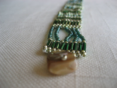
There are two things that I like about this one: 1) its texture, with all those bugle beads (the long cylindrical ones) lined up like ribs, and 2) all the different greens I used in it. This one, maybe more than anything else I've made, I just do not get tired of looking at.


3. This necklace I made as a showcase for some nifty glass beads I found (mumble) years ago:
4. Another bracelet, which came out a bit messy, that I made trying to come up with a way to use some of the extra agate beads I didn't use making this or this: ... and 5. A big old cuff bracelet I made to match this necklace:

*Not really wearing it, since I made it to fit a smaller wrist than mine, which my sister says is larger than most women's by about an inch. I have draped the bracelet over my wrist to model it, applying pressure strategically to keep it wrapped around, rather than just lying on, this overlarge extremity.